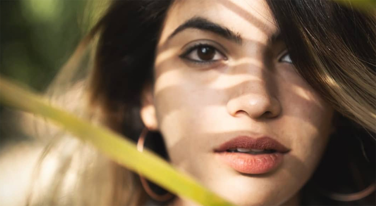
The Art of Visual Design with Aarushi Jain
As usual I was on social media procrastinating when I came across some very exciting and visually stunning work by Aarushi Jain. A visual designer and illustrator hailing from Indore, Madhya Pradesh and an alumni of the National Institute of Design, Ahmedabad. Below are excerpts from our digital interaction.
As Aarushi puts it, “at NID, I learnt some design, among other life skills. I do a lot of design for film. This can either mean creating a visual grammar for the project - across the opening and closing sequences, the in-film visuals, introducing visual interventions and sometimes also the publicity ; The other type of projects are where I will design graphic props and backdrops for the set. This will mean going into the smallest of details to build an immersive world and nudge the narrative forward. Both are such fun processes - I secretly love to think of the visual design as a secondary narrator of the story, and thoroughly love delving into the story, its style, the time it’s set in, and the quirks and idiosyncrasies of the characters and of the story itself. Apart from this, I love a good branding, publication or illustration project!”
AG: Can you share with us how your background in Exhibition Design at the National Institute of Design has influenced your approach to visual design for shows and films in the real world?
When I graduated, I was pretty sure I was going to go out and design museums. I loved doing narrative spaces. Just when I had almost confirmed my joining at my dream museum design studio, I got an opportunity to work on a film set. I thought I’ll give it a quick try, but ended up staying. In hindsight, all my work at NID also leaned towards marrying writing to visuals to space - so a films made perfect sense! Over time I found myself leaning towards visual and graphic storytelling more, and naturally moved towards it.
The thing about exhibition and space design at NID is that you’re never forced to stick to a medium to tell the story. We learnt and used everything - graphics, animation, interaction, film, materials. One of my design projects was a narrative space led by poetry, one was inside a kitchen, and one was a speculative marketplace of futuristic antiques - so there were really not many rules! As a result we learnt to think in terms of storytelling and the medium became free for exploration. Not only does this help me do different types of projects, I think it also translates to designing for film - which again, has so many mediums to exploit - the space, the writing, the cinematography, the visuals.
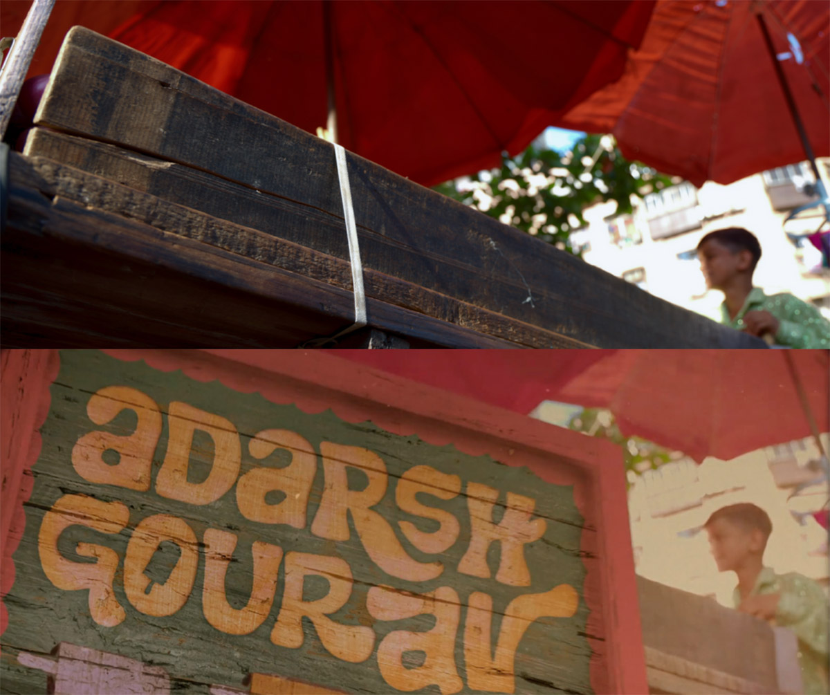
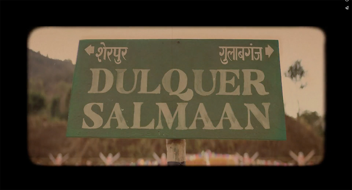
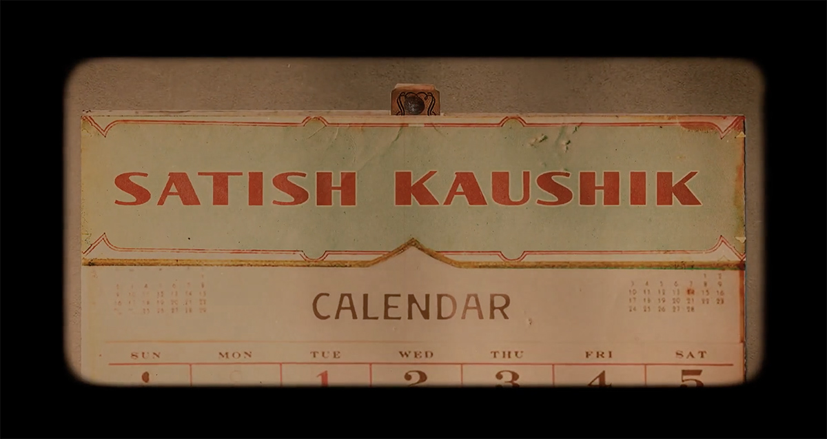
Guns & Gulaabs | End Credit Sequence
AG: Your portfolio includes a diverse range of projects, from shows like "The Family Man" to "Guns and Gulaabs." and much more. How do you adapt your design and process to suit different styles, mediums and genres?
I’m actually extremely lucky to have gotten opportunities to work on such stylistically different projects. The first step in the process is always to try and understand that style. Talking with the makers becomes the first step, because how they see the show is how it's meant to be seen. Both these projects were Raj and DK and Suman Kumar, so props to them for making something different every time!
After the briefing session, I will research, reference, iterate, play around to see how best I can approach it visually. That will usually inform the medium and treatment.
Before/After of a shot
AG: In your work, you mention a focus on capturing the "humour and heart" of a subject. Could you elaborate on how you infuse these elements into your visual designs, particularly in projects with varied themes?
I enjoy making it personal, finding what would make people laugh or feel warm inside, and working with that. I am convinced that is the language that everybody speaks and responds to. The power of small details, surprises and little connections hiding just out of sight – is to me, underrated. Looking at something and discovering something else within it is a top tier human experience. Like the arrow inside the FedEx logo. Or when you take a sip of water and realise its actually gin.
My favourite thing to do is to leave a sneaky surprise to be discovered on screen.
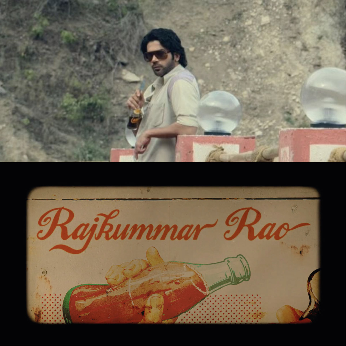
In the Guns and Gulaabs closing credits, each slate has a hidden connection or reference to their characters. For eg., Dulquer Salmaan’s character is stuck between 2 rival towns, so his name comes up on the board separating their borders.
Satish Kaushik’s calendar is not only a 90s memory and tribute to his beloved Mr. India character, but also a nod to his character being bullied by a looming deadline.
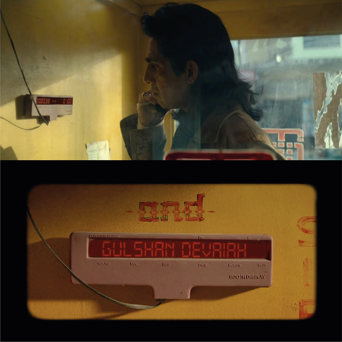
The idea is that as a viewer progresses further and the story unfolds, the references sweetly unravel. In the first episode credits, the phone booth timer is simply a warm, yesteryear callback. When you see Atmaram’s hilarious scene with it, it instantly becomes funny. Plus, it lodges a connection, making it memorable.
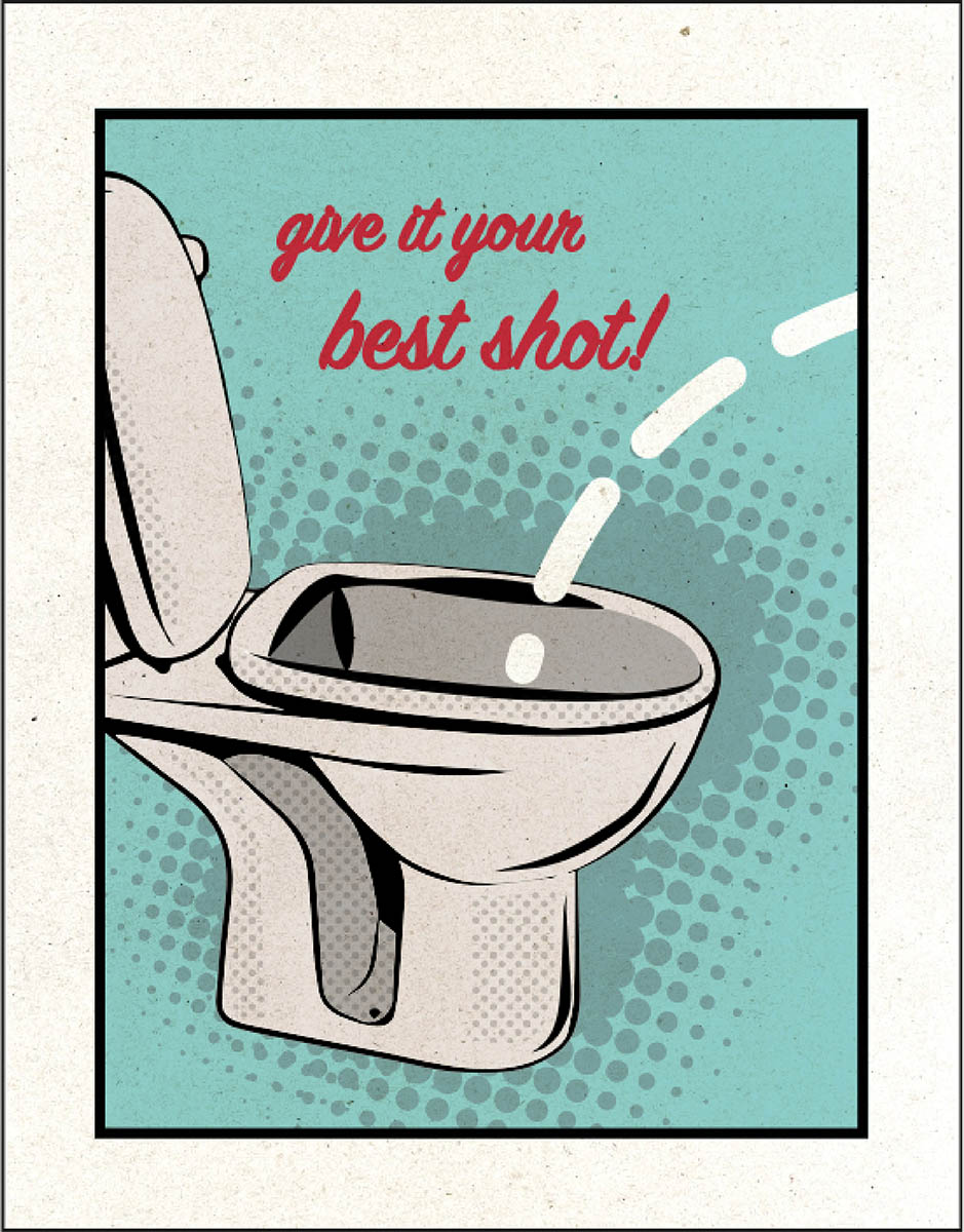
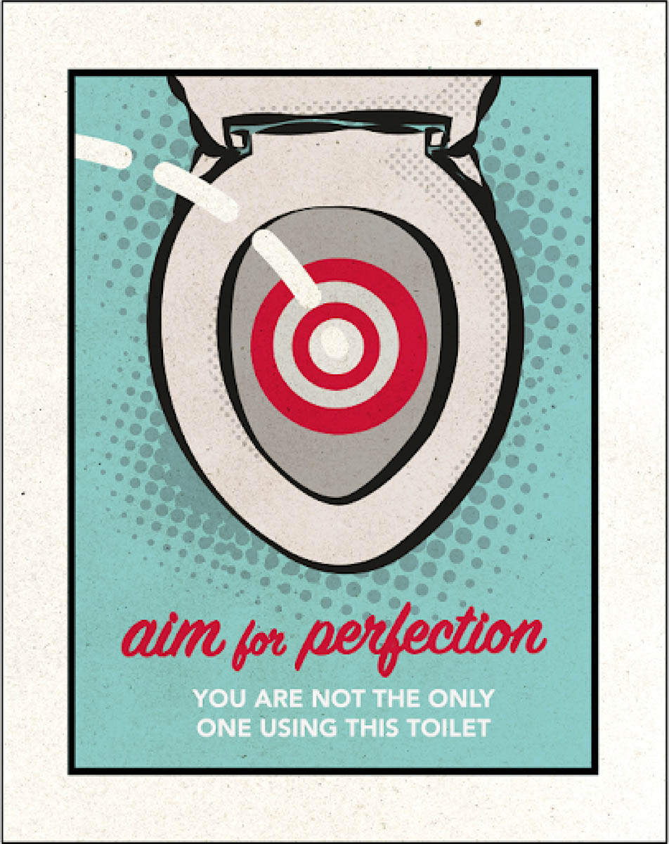
Sometimes its small things in the background of the set. In The Family Man 2, we see the boss be one of these corporate men who spout stuff like ‘Don’t be a minimum guy!’ or ‘Success is not optional’. There was supposed to be a scene in the office’s mens bathroom after that, where we put up a bunch of cheesy ‘corporate art’ posters featuring a toilet seat saying ‘Aim for perfection - you’re not the only one using this toilet’ or ‘Give it your best shot!’. Not every project lends to it, but it's fun 🙂
AG: "The Night Manager" and "Farzi" have distinct visual aesthetics. How do you collaborate with directors and production teams to ensure your designs align with their vision? What was your role, what did you do?
For both of these projects, my role was pretty different. For Farzi, as visual design consultant, I would work closely with the directors as well as say the post team or the creative team at Prime Video to a) design a visual grammar for the show and b) make sure it informs everything from the in-film graphics to the publicity. With The Night Manager, my role was to create graphics for the set. So you work within a larger Art department, in close collaboration with the Direction team. In this case, all the teams will have discussed and aligned to a vision during pre-production, much before we actually start shooting.
AG: Can you share an instance where a project's subject matter posed a unique design challenge? How did you overcome it to create a compelling visual solution?
In general, the visual design or the graphics are a key storytelling tool in films. If a certain event in the plot needs to be conveyed, you put it on a newspaper for a close up shot. For Farzi, it was important to establish the locations as different borders that were being crossed, so we came up with animated maps that dissolve onto the scene.
AG: As an independent visual designer, you likely have a degree of creative freedom. How do you balance your artistic instincts with the practical demands of each project? Also do you manage budget vs time vs effort ?
It’s always a struggle to find that balance and I think I’m still learning to. I have burned myself more than once being too ambitious! However, yes. As an independent designer who often works alone - you do need to set up boundaries as to what’s achievable within a time frame and budget with the resources we have. Often the initial idea will also filter through many production or legal restrictions to get to what you finally start working on! You just have to find a balance that everyone is happy with!
AG: Your work has contributed to some of India's most acclaimed shows. Looking ahead, what excites you most about the evolving landscape of visual design for entertainment, and what aspirations do you have for your future projects?
It is definitely an exciting time for the role of visual design in entertainment. While in the West we have movies like those of Wes Anderson, or even Spiderverse, where the graphic design is almost another character in the film, it’s been an often overlooked tool in India. However everyday we see more and more people noticing it, appreciating it and investing in it - whether it is titles sequence, the in-film visuals or the publicity. This opens so many possibilities for fun interventions and alterative ways to tell a story and that’s what I want to do more of going forward. More specifically, I’m excited to design more of opening or credit titles.
Outside of films, I want to illustrate tons of books!
It was an absolute pleasure interacting with Aarushi and we wish her the best and brightest for the exciting times ahead. Beyond the silver / bronze / LED screens, you can reach out to her on the links below.