Advancing 2d Animation for today’s times
The recent film ‘Klaus’ directed by Sergio Pablos, in his directorial debut, has been receiving rave reviews by both critics and audiences alike. It tells an alternate origin story of Santa Claus, through the eyes of a postal worker who arrives at a troubled distant northern town. Along with the heart-warming story and humour, much of the praise is also directed towards the refreshingly beautiful visuals which seem like a perfect marriage between 2d and 3d animation.
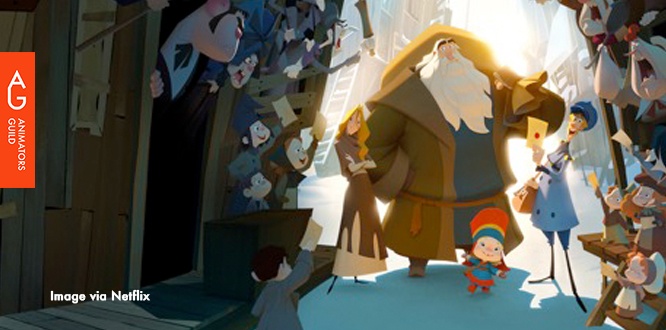
The production of this film is a breakthrough for 2d animation workflow, in its application of cutting-edge digital technology and tracking to a traditional animation pipeline. Utilizing innovative lighting and texturing tools they have layered in light and shadow to give an almost volumetric and hand-drawn appearance to the characters, which many a time will make the viewer wonder if the characters were animated in 2d or 3d?
Animator and Director Sergio Pablos had previously worked with Disney classics (Tarzan, Hercules, Hunchback of Notre Dame and Treasure Planet) and later created the ‘Despicable Me’ movie franchise based on his original story. Klaus is a passion project for Pablos who wanted to create a movie that not only looked unique, but also its own sense of storytelling and tone. He didn’t want the characters to look like the standardized visual of ‘stickers put on painted backgrounds’.
Animator and Director Sergio Pablos had previously worked with Disney classics (Tarzan, Hercules, Hunchback of Notre Dame and Treasure Planet) and later created the ‘Despicable Me’ movie franchise based on his original story. Klaus is a passion project for Pablos who wanted to create a movie that not only looked unique, but also its own sense of storytelling and tone. He didn’t want the characters to look like the standardized visual of ‘stickers put on painted backgrounds’.
Working at Madrid-based Sergio Pablos Animation Studios (SPA Studios), Pablos and his team were looking for ways to advance the medium of traditional animation, which they felt would serve the film’s story better. They knew that bringing traditional animation back would not be enough; they had to bring it forward. They wanted to pick up where 2d animations have stopped innovating and to fill the gaps which they found with lighting and colouring.

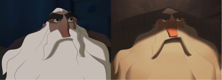
Character with traditional lighting and texturing (left) and how the character appears in the film (right) Image credits - www.cartoonbrew.com
Toon Boom’s Storyboard Pro and Harmony was used as part of the animation pipeline for ‘Klaus’. After storyboarding with Storyboard Pro, they would go straight to layout which was done digitally on tablets. Depending on whether it a 2d or 3d shot, the layout would be split. Then they would animate it hand-drawn frame by frame directly in Toon Boom Harmony, which would be given to a clean-up team. The cleaned-up frames would be given to ink and paint artists, where they would treat the lines. Only the lines that were required to convey information were retained (mostly internal lines in the face or hands), others were removed since they had information in the form of colour and contrast.
Szymon Biernacki and Marcin Jakubowski, the film’s production designers, as well as Anaël Seghezzi helped develop the proprietary tools for lighting and texturing at his company Les Films Du Poisson Rouge, in Angoulême, France.
Marcin realized that to attain the hand-painted look, it had to be hand-made. Hence he removed the usage of all the automated computer-generated lighting solutions on the 3d mesh, so as to enable the artist to paint directly with light. Knowing the kind of features he needed, they built a prototype software using Nuke. They released a teaser for the film using this system in 2015. Even though it was good as a proof of concept, they wanted to make it more accessible and efficient.
Around 2014, Anaël Seghezzi and his team did some tests on few 2d animated shots sent by SPA Studios; these were the shots lit by Marcin using the new method he had developed. They were able to add brush strokes and textures to the 2d characters semi-automatically and they demonstrated this rendering technology to Sergio Pablos.
Few years later, SPA Studios reached out to Anaël’s team when they found it very challenging to apply light and shadow during the production phase. Anaël had been working on a 2d animation software called Houdoo which had a very effective inbetweening and tracking system. By modifying the software, he was able to show the studio that it could fasten up the process of light and shadow animation.
Later after exchanging information with Marcin on his technique, Anaël started developing a prototype software based on Houdoo’s technology, which led to the creation of this lighting tool called KLaS (Klaus Light and Shadow). Featuring automatic tracking and inbetweening with real-time rendering, it was used by Florian Aupetit’s light and shadow team at SPA. Toon Boom was an important part of it; the whole thing - from storyboarding through to ink and paint - was all based on the Toon Boom pipeline.
Later after exchanging information with Marcin on his technique, Anaël started developing a prototype software based on Houdoo’s technology, which led to the creation of this lighting tool called KLaS (Klaus Light and Shadow). Featuring automatic tracking and inbetweening with real-time rendering, it was used by Florian Aupetit’s light and shadow team at SPA. Toon Boom was an important part of it; the whole thing - from storyboarding through to ink and paint - was all based on the Toon Boom pipeline.

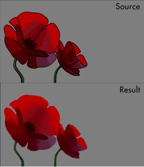
Process breakdown credit - Les Films Du Poisson Rouge
The lighting was also simplified down to “key light,” “bounced light,” “ambient,” “occlusion,” and “rim light” to make the process comprehensible for 2d artists and also to avoid making it look ‘too 3d’. After starting a shot, the lighting artists had to examine the frame of the animation and create the shape of lighting for the chosen light passes.
Work was only necessary on the key frames, and the data from the tracking system automatically interpolated all the in-between frames. In case of failure of the tracking system, the lighting had to be hand-painted frame by frame by the artist. Finding colours, maintaining the style of the shapes, matching the lighting to make the character fit with the background and to make the character appealing were amongst some of the challenges faced during the lighting process.
Work was only necessary on the key frames, and the data from the tracking system automatically interpolated all the in-between frames. In case of failure of the tracking system, the lighting had to be hand-painted frame by frame by the artist. Finding colours, maintaining the style of the shapes, matching the lighting to make the character fit with the background and to make the character appealing were amongst some of the challenges faced during the lighting process.
MOE is another custom software, on which Anaël’s team were working simultaneously for the texturing pipeline. It was also developed at Les Films Du Poisson Rouge. This software was very valuable in production, since it could a process a sequence of frames to find the visual data like the lighting, motion and the contours to replicate traditional styles like watercolour, crayons or oil paintings. To know more about these tools, you can watch their video:
Finding artists and talented people to work on this project was also quite a challenge for Szymon Biernacki. Traditional layout artists that could work on high quality feature film work were hard to find. They realized that the closest profile they could get was that of a concept artist, who could draw and paint. Hence they decided to merge the layout and background teams, which meant that their layout artists were also designing and conceptualizing art as they did their BG layouts.
The usage of CGI was reserved for the animation of certain complex elements, like the ferry, Jesper’s wagon, Reindeers, some of the landscapes, etc. since animating them would have been tedious in the 2d space. Many of the 3d elements were done in Maya, depending on whether it was easier to create them in a 2d or 3d workflow.
The end result is a great movie that looks gorgeous with its 2d characters that blend in positively with the background and the lighting as a cohesive whole. Take any frame from the story and it looks like a painting. It may well be on its way to becoming a classic animated film.
This movie got a digital release through Netflix on November 15, after having been released in select theatres a week prior. It also marks a first for Netflix as it forays into original animated feature content. With nearly 30 million views worldwide, ‘Klaus’ is been declared a hit by Netflix.


